


Choosing the Right Outdoor Color Palette for a Calm, Elevated Look
The colors you choose for your outdoor space shape how you experience it. They define the mood and influence how relaxed you feel within it. Whether you’re creating a rooftop sanctuary or a quiet garden corner, the right outdoor color palette can transform everything.
At Balè, color is never decoration alone. It’s an extension of craft. Our finishes and textures are chosen to blend with the natural world.
Why Color Matters Outdoors
Outdoor spaces live in constant motion. Light changes, shadows shift, plants bloom and fade. The right colors move with these changes. A calm palette offers:
Visual softness that complements natural light
Surfaces that stay cooler and more comfortable
Subtle flow between indoor and outdoor areas
Longevity that feels effortless
1. Warm Neutrals: Earth, Sand, and Bone
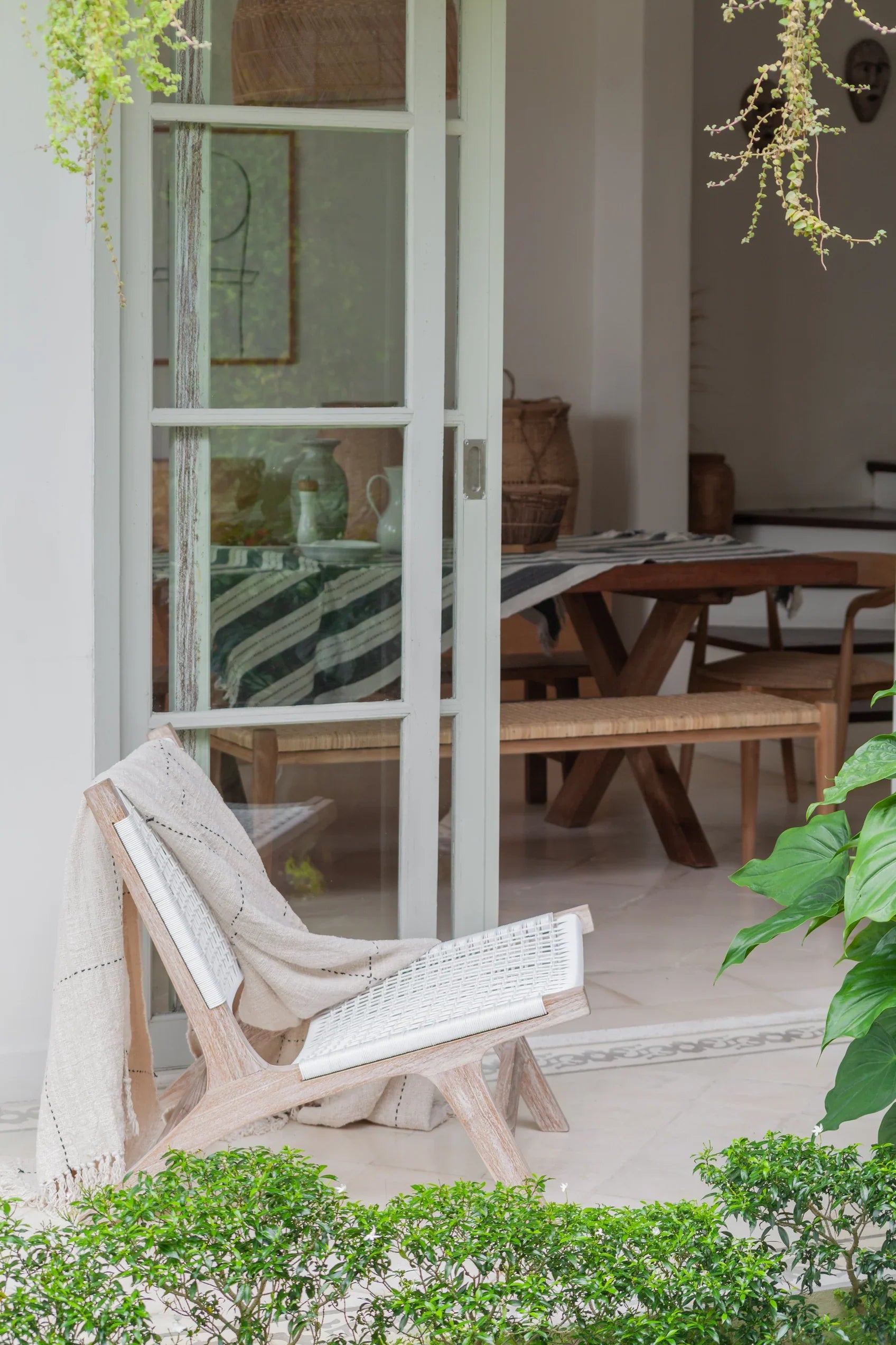
Earth tones always feel grounded. They draw warmth from the landscape and give outdoor spaces quiet depth. Shades of sand, oatmeal, and pale stone work beautifully for patios and sunlit decks. These hues pair with natural teak and woven textures, echoing the calm of coastal mornings and the softness of linen.
Balè Match: Daybeds with light cushions, teak frames, and soft fabric tones that look natural under any sky.
2. Cool Clay: Taupe, Mushroom, and Soft Grey
For homes with modern or architectural character, clay tones add sophistication. They bring contrast without sharpness, depth without heaviness. Use taupe and mushroom for surfaces, textiles, or planters. Their muted quality works well with concrete, dark wood, and stone.
Balè Match: Lounge chairs in teak with mushroom-toned cushions or stone stools in cool neutrals.
3. Soft Whites and Chalks
White is tricky outdoors. Too bright, and it reflects light harshly. But soft whites, off whites, and chalk tones create space and calm. They make smaller areas feel open and air filled. These hues are perfect for courtyards or balconies. They act as a canvas for natural textures like rattan.
Pair with: Teak furniture, woven throws, and rough-edged ceramics for a look that feels gentle and pure.
4. Green Greys and Sage Tones
Green tinted neutrals bridge the built and natural world. They dissolve boundaries between garden and structure. These tones are subtle but full of life. Sage, olive, and eucalyptus hues blend into foliage, helping your outdoor color palette feel complete. They also soften angular architecture and concrete edges.
Balè Match: Teak benches with sage linen cushions or accent stools finished in muted green undertones.
5. Black as an Accent, Not a Base
Black adds discipline to a soft scheme. It frames light and makes natural colors stand out, but too much can feel stark. Use it sparingly such as a lantern frame or a detail on a cushion. Less is more.
Balè Match: Outdoor stools with slim black legs or candle holders in matte finishes that add subtle structure.
Balancing Texture and Tone
Color alone doesn’t bring depth, texture does. Pair smooth surfaces with something handworked. Let linen sit beside stone, and grain meet glaze. When you mix these elements, the space starts to breathe. Tone on tone styling keeps things peaceful. Slight variations within a palette create richness without clutter. Texture is what turns neutrals into art.
Try combinations like:
- Bone with oat and sand
- Taupe with mushroom and charcoal
- Chalk with linen and birch
Creating Zones Through Color
In open outdoor layouts, color can help define purpose. It’s a gentle way to create structure without walls. Repeating tones in cushions, planters, and fabrics ties the whole design together without overthinking it.
Dining zones: Slightly darker tones to anchor the table
Lounging areas: Pale neutrals that invite rest
Pathways and entries: Contrasting accents for visual direction
Mood Mapping With Color
Color shapes emotion as much as aesthetics. It can slow the pace or lift the energy of a space. Let your palette reflect how you want to feel when you step outside. Color is emotion made visible. Use it as a language to express mood:
Peaceful and airy: Chalk, sage, and bone
Modern and grounded: Taupe, black, and mushroom
Warm and open: Sand, oak, and terracotta
Designing With Balè: Where Color Meets Craft
Every Balè piece is created with color in mind. Our teak, rattan, and textiles are chosen to harmonize with natural light and shifting seasons. The tones evolve, not fade, and the materials age beautifully.
When you choose Balè, you are choosing a philosophy of calm. Design that lives easily with the world around it.
A Palette With Purpose
A thoughtful outdoor color palette can take your space from feeling drab to fab. Choose colors with intention and build as you go on. The space should be a reflection of your personality and lifestyle. Take these tips and make them your own. We're setting you free, time to make something magical.